library(dplyr)
library(here)
library(forcats)
library(lubridate)
library(purrr)
library(lubridate)
library(ggplot2)
library(stringr)Signal strength
Load your data in your R environment - see Load & Format > Reproducibility
# Mean signal strength per individual, site and time categories (HD, HN, LD, LN)
data_all <- data_all %>%
  group_by(Band.ID, tideCategory, recvDeployName) %>%
  mutate(sig_indiv_tideCat_mean = mean(sigPositive),
         sig_indiv_tidecat_sd = sd(sigPositive)) %>%
  ungroup()  %>%
  mutate(speciesINIT = str_split(speciesEN, " ") %>%
           map_chr(~ str_c(str_sub(.x, 1, 1), collapse = "")) %>%
           toupper(),
         tideCat = str_split(tideCategory, "_") %>%
           map_chr(~ str_c(str_sub(.x, 1, 1), collapse = "")) %>%
           toupper())
Here, we take the relative signal strength value sigPositive (a derivative of the raw values sig) to calculate the Standard Deviation (SD) (sig_indiv_tideCat_sd) for each individual and per tide category. This will inform us about signal strength variation for each individual depending particular conditions (tide category * day/night * sites).
Then, we group the SD per species and per site to observe how the signal strength varies.
Then, we can create a list which plots the distribution of the average signal strength SD variation across species.
# One plot per species for better understanding
plots_list <- data_all %>%

  split(.$speciesEN) %>%

  purrr::imap(~ {

    species_full <- .y  # The split name (full species name)

    ggplot(.x, aes(x = tideCat, y = sig_indiv_tidecat_sd, fill = speciesEN)) +
      geom_boxplot() +
      facet_wrap(~ recvDeployName) +

      scale_fill_manual(values = species_colors, guide = "none") +
      theme_bw() +
      labs(title = paste0("Variation of Signal Strength SD for ", species_full, " over Motus stations"),
           x = "Tide Category",
           y = "Variation of Signal Strength SD (RSSI)",
           fill = "Species")
    })

# Rename list elements to initials using the inverse mapping
names(plots_list) <- names(species_init_colors)[match(names(plots_list), names(species_colors))]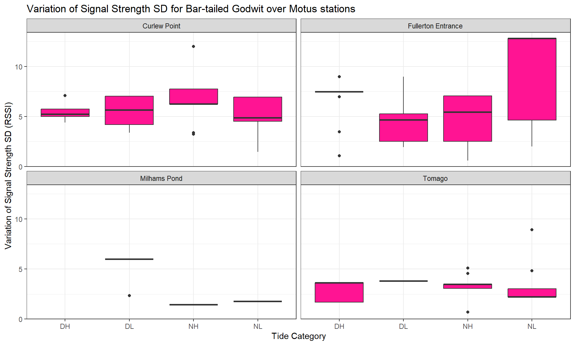
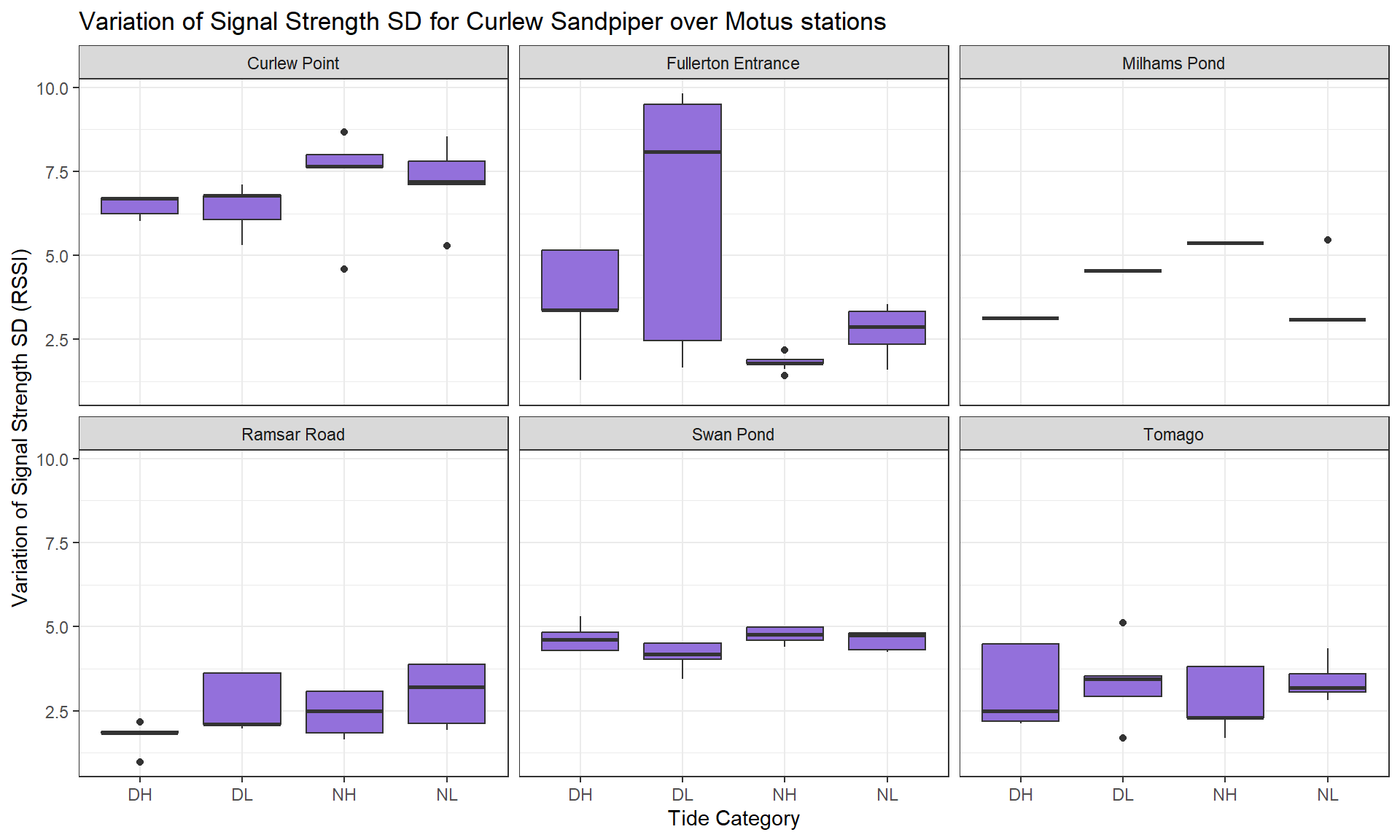


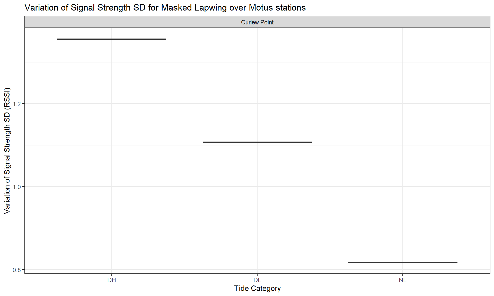

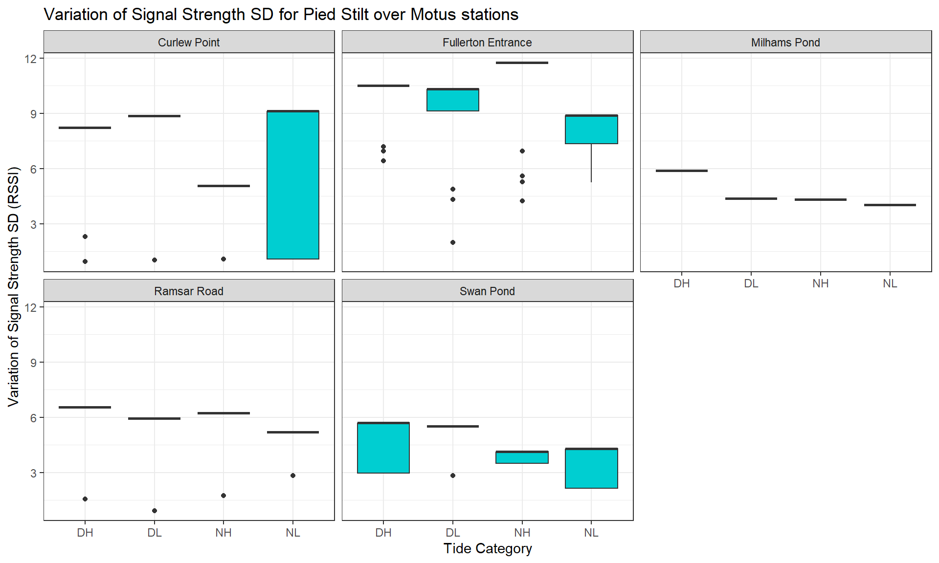
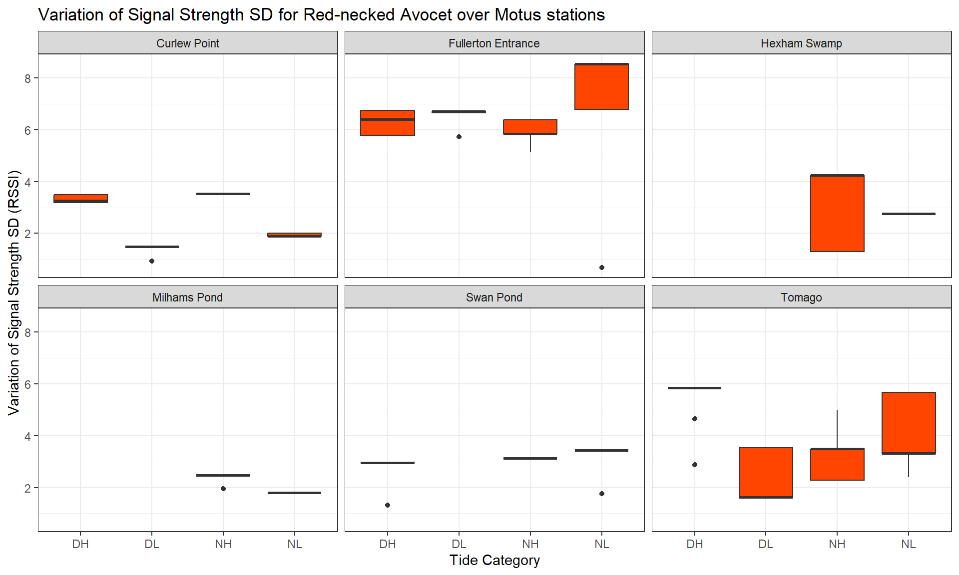
Legend: The average value of the signal strength has been calculated for each individual, so you can see its distribution (boxes on vertical axis) depending the tide condition (horizontal axis) and for each species (tabs).